I was in an airport, doing one of my favourite airport activities: browsing news stands whiling away the wait for the plane – like everyone, better safe than sorry, always early in airports.
I like a magazine in particular that deals with high tech, new trends, the evolution of the technological society, so I looked for it [1], . I liked the fact that it had an interview with Satya Nadella, Microsoft’s CEO. I have had a love-hate relationship with Microsoft (like many people), because I began with Windows back in 1988, hated them around 1995, liked them again when I started doing accessibility because they were the only ones doing it in 2004, and so on. So, knowing this guy is not that bad, I wanted to know what was happening, so I bought the issue.
Here’s the cover:
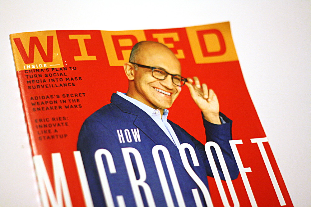
What do you read? Wiped?
I find it interesting that this brand is so well known for some people (the trendy, yuppy web and high-tech people) that I immediately identified the magazine as Wired.
I wanted to test on unknowing guinea pigs but found none, but I’m pretty sure we’d be able to find people who read it Wiped.
Before Photoshop, the concurrence between the top of a head and a logo was usually resolved by pasting the logo on the forefront of the person on the cover. Now, digital publishing enables you to be more subtle, half-hide letters (Elle does it a lot), and hope people know your brand.
Wiped. Hehe. “Once you’ve seen it, you can’t unsee it.”